Birthday Shoot Recap
This was a tough one - I was approached by a friend a few hours before this event to be a photographer for a birthday party. I wanted to take the job to build the portfolio but also to get more exposure with shooting indoor events. For obvious reasons, it's tricky to shoot indoors in artificial lighting - but add in varied colors coming from the TVs on the walls surrounding the private room and additional yellow light from the pizza buffet further complicated how I was shooting any given second.
However, I was excited to get more work out of the new 85mm f1.8 lens I got, and it proved to be up to the challenge. My preference would have been to get a bit more space to work with the longer lens, but I can't be too upset with the final shots here. The wide aperture let in plenty of light (albeit some weird lighting at times) for the editing bay. The theme in editing was white balance and color grading - both tools were used to counteract the rogue greens and blues that were cast by the TVs showing the Masters.
When color grading, the start of the process begins with selecting a white balance setting on the camera itself before a picture is taken. Depending on lighting conditions and where I am, I select the Cloudy, Fluorescent, or Incandescent settings on my Nikon ZF in order to find that starting point on a natural-looking image. In the editing bay, I started outside of my usual workflow to fine-tune the white balance on the photos. In the "Color" dropdown menu, I used the dropper to select a whiteish/gray point on the picture to get colors to further correct what my camera already helped me with. Sometimes this took a few tries in order to get it right, and my highest success rates with this tool seemed to be the ceiling and the white accent pieces on the wall. I made a few final adjustments with the blue-yellow temperature and the green-pink tint sliders to get the look exactly where I wanted them.
The next element that I played with to help with color was adding midtone, shadow, and highlight accent colors. Most frequently, I utilized adding a color on the highlights to help counteract glows from the TVs.
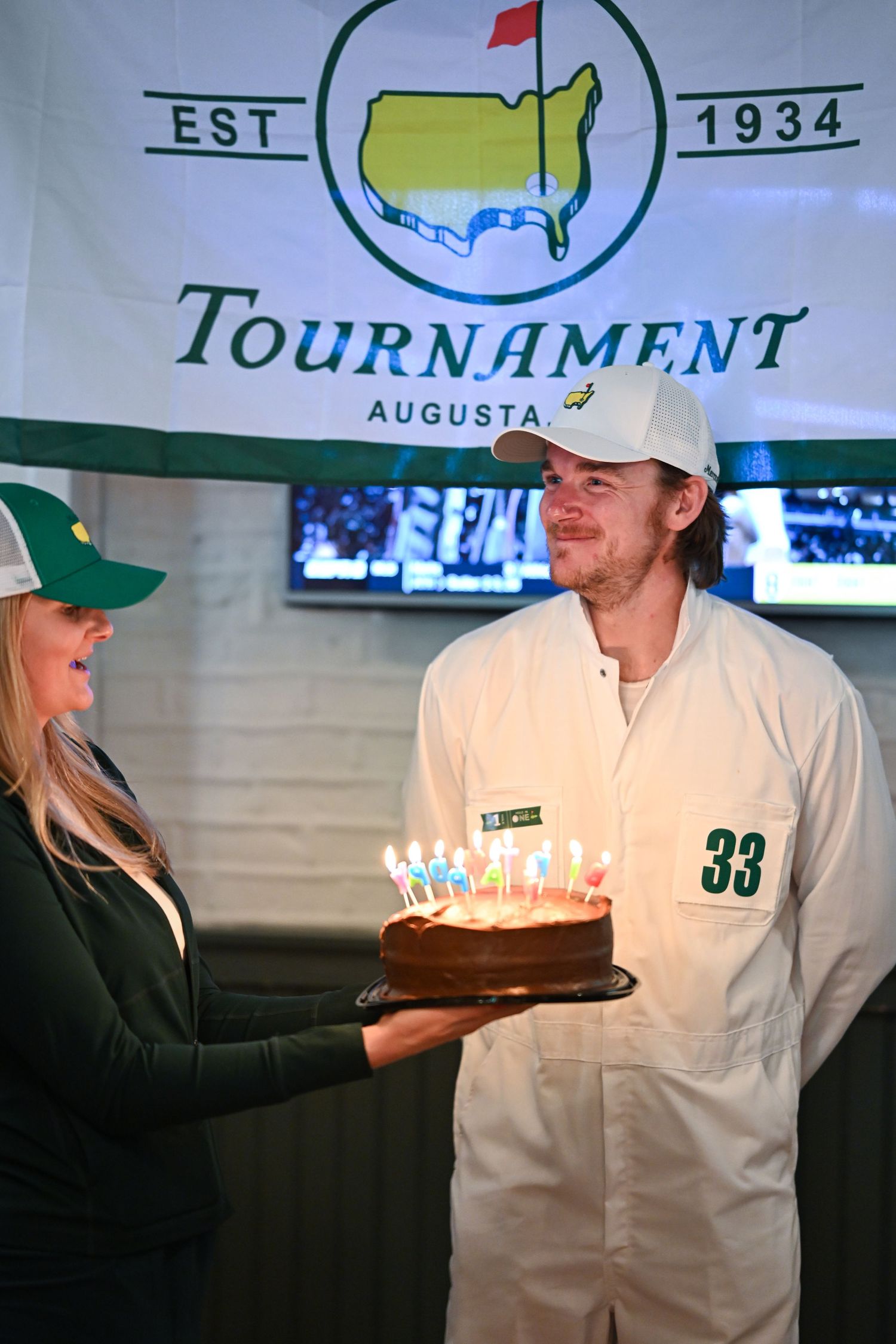
Take this final picture on the left and the pre-color graded picture on the right
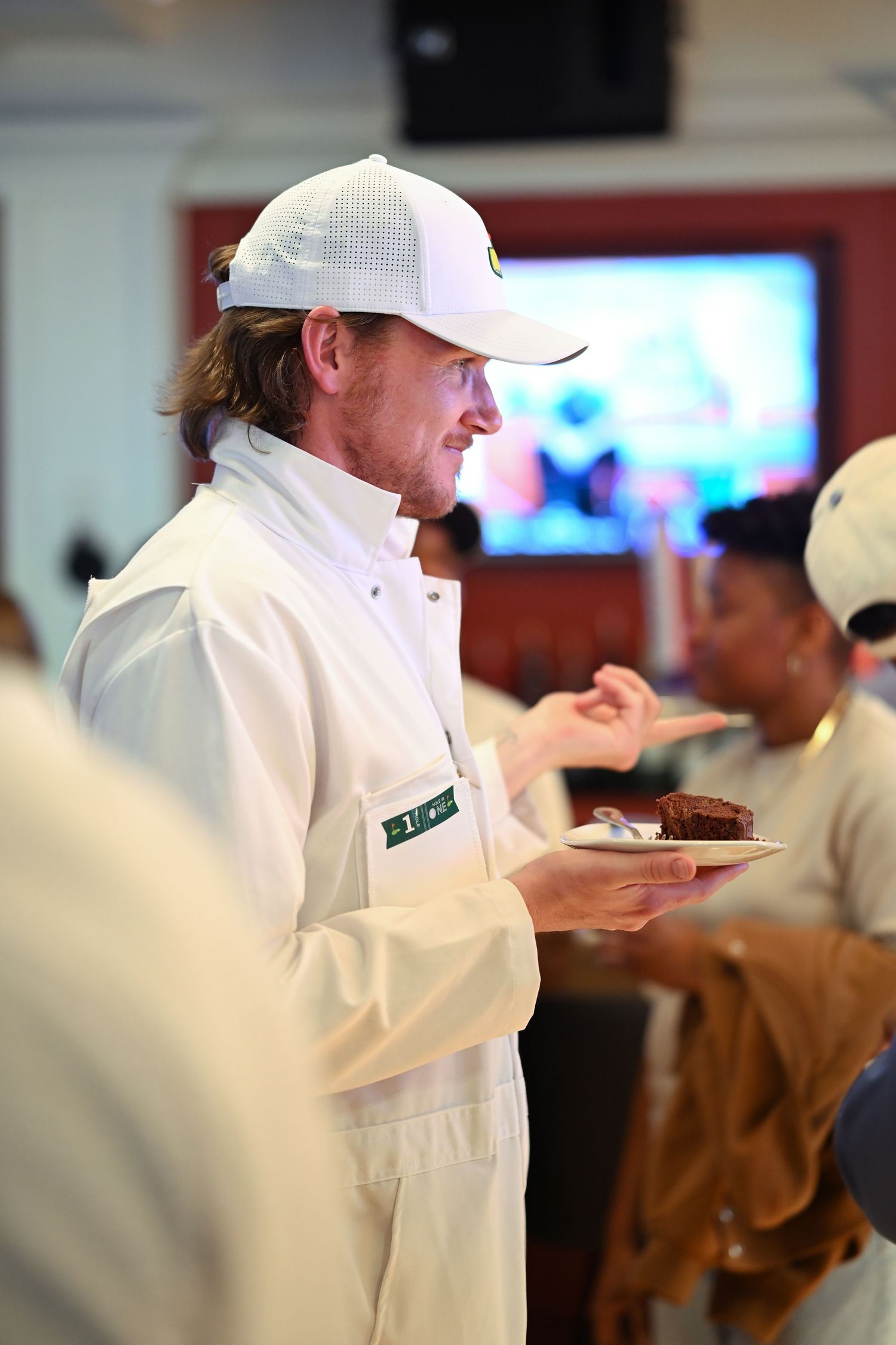
Final posted image, using a slight green highlight
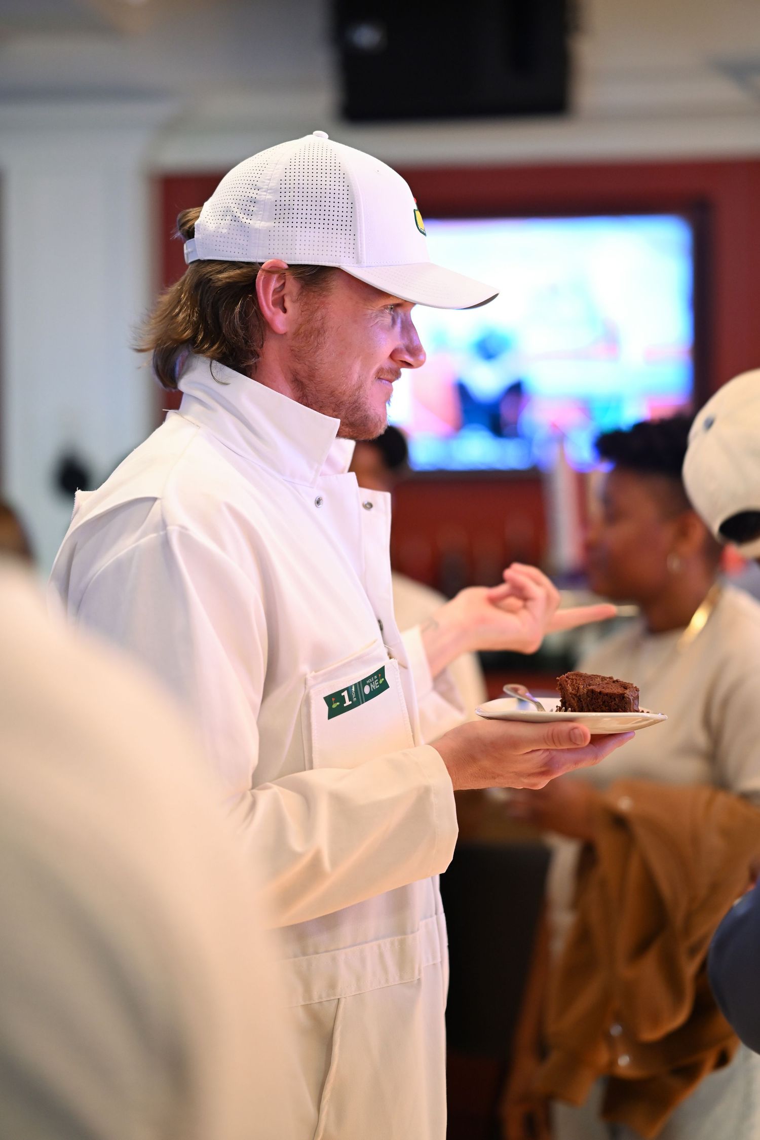
Before color grading
Note how the picture on the right looks very pink/purple on Brian's face and the front of his Master's jumper. Understanding that green is opposite to purple on the color wheel, I can add green to the brightest of purple highlights to help counteract
Now, I could have just played with white balance more and used the green-pink tint slider to add more green universally. However, that picture below represents what that looks like, and I'm not a big fan of it. It's subtle, but enough for me to notice.
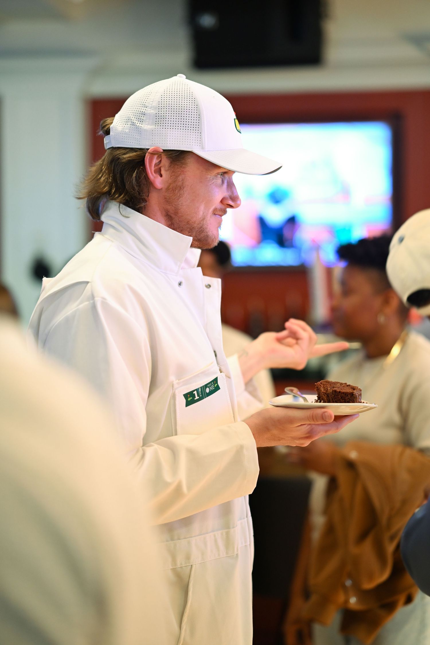
Universal green tint applied, less of a fan here as opposed to just modifying green highlights above
While Brian's face looks the same in both the green highlights vs universal green tint, I think some of the subtle background details in the universal green tint wasn't quite what I was going for. In the posted photo, I liked the red wall giving some color contrast as opposed to a more muted look in the universal green tint, Shana's face in the background looks a little more natural in the posted photo, and the wall trim looks slightly more pure white than the universal green tint.
In the future, I think there is more I can do with using these colors to give a mood or different look to a photo as opposed to just counteracting existing and interfering colors, but I was generally happy with this foray into playing more with these color tools.